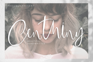
Centhiny: A Contemporary Script Font That Elevates Real-World Design Workflows
Centhiny is a stunning script font with a contemporary look—designed not just for visual appeal but for functional integration across professional and creative workflows. It bridges the gap between expressive typography and practical usability, offering a refined hand-drawn aesthetic that maintains clarity, rhythm, and typographic integrity. Unlike many decorative scripts that sacrifice legibility or versatility, Centhiny balances personality with precision—making it a reliable asset from early concepting to final delivery.
Where Centhiny Fits in Your Design Process
Typography isn’t an afterthought—it’s a structural element that shapes how information lands, how tone is conveyed, and how quickly users engage. Centhiny enters your workflow where intentionality meets expression: in branding systems, editorial layouts, digital campaigns, packaging, and presentation assets. It’s especially effective when you need to signal authenticity, craftsmanship, or approachability without slipping into cliché or informality.
You’ll often reach for Centhiny during the refinement phase—not at the start of ideation, but once voice, audience, and hierarchy are clarified. For example, a small business owner finalizing a product launch campaign may use Centhiny for hero headlines and signature taglines, while keeping body copy in a neutral sans-serif like Inter or Roboto. This pairing creates contrast with purpose: Centhiny carries emotional weight; the supporting type ensures readability and scalability.
Using Centhiny Before, During, and After Key Project Milestones
Before execution: Test Centhiny against your brand’s existing color palette and imagery. Its high x-height and open counters hold up well on screens and in print—but subtle variations in letter spacing or baseline alignment can shift perception. Preview it in context: drop it into a mockup of your Shopify banner, email header, or Instagram carousel before committing to full implementation.
During production: Centhiny works best when treated as a strategic accent—not a default. Use it sparingly for emphasis: a single word in a headline (“Handcrafted”), a call-to-action button (“Join Us”), or a logo lockup where it complements (rather than competes with) a secondary logotype. Avoid setting full paragraphs in Centhiny; its connected strokes and variable stroke width aren’t optimized for extended reading.
After delivery: Audit how Centhiny performs in real environments. Does it render cleanly on older Android devices? Is it legible in thumbnail previews on social feeds? If you’re embedding it via web font (e.g., through Google Fonts or a self-hosted WOFF2), verify fallback behavior. Pair it with a system font stack (e.g., "Centhiny", "Segoe UI", system-ui, sans-serif) so interfaces degrade gracefully if loading fails.
Integration With Tools, Platforms, and Team Practices
Centhiny is available in standard OpenType (.otf) and web-ready formats (.woff2), making it compatible with Adobe Creative Cloud apps, Figma, Sketch, Canva (via upload), and modern CSS environments. In Figma, leverage its OpenType features—like contextual alternates and ligatures—to fine-tune flow without manual adjustments. In Adobe Illustrator, enable “Fractional Widths” and “Optical Kerning” to preserve its natural rhythm at larger sizes.
For teams, consistency matters more than novelty. Establish clear usage guidelines: define approved sizes (e.g., 24px minimum for web, 36pt minimum for print), specify where Centhiny may appear (logos, quotes, subheads), and list prohibited uses (captions, data tables, mobile navigation). Share these rules in your design system documentation—not as restrictions, but as guardrails that protect both brand coherence and user experience.
If you collaborate with developers, provide them with exact font weights (Centhiny includes Regular and Bold variants), character set notes (it supports Latin-1, Latin Extended-A, and basic punctuation), and rendering tips—especially around anti-aliasing settings in CSS (font-smoothing: antialiased; often yields cleaner results on macOS).
Practical Implementation Tips for Real Workloads
- Start with contrast. Pair Centhiny with a highly legible, low-contrast sans-serif (e.g., Inter, Manrope, or Poppins) rather than another script or display font. This avoids visual competition and reinforces hierarchy.
- Adjust tracking deliberately. At large sizes, slightly increasing letter spacing (5–10 units in Figma or Illustrator) improves airflow and prevents crowding—especially in all-caps applications.
- Test at scale. View Centhiny at 100%, 200%, and 50% zoom in your design tool. What reads beautifully at 72pt may blur or tighten unpredictably at 14pt. Adjust accordingly.
- Use it to reinforce narrative. In educational materials or storytelling presentations, apply Centhiny only to key takeaways or human-centered phrases—“Your Journey Starts Here,” “Built With Care”—so it serves meaning, not decoration.
- Consider licensing early. Centhiny is commercially licensed. If you’re designing for clients, confirm whether your license covers redistribution (e.g., in templates or SaaS dashboards) or requires individual purchases per end user.
Long-Term Usability and Quality Control
A font’s longevity depends less on trendiness and more on adaptability. Centhiny holds up over time because its design avoids extreme quirks—it doesn’t rely on exaggerated swashes or unpredictable connections that date quickly. That said, monitor how it interacts with evolving platform standards: as variable fonts gain adoption, check whether a future Centhiny Variable version becomes available for finer weight or width control.
Build quality checks into your process. When reviewing deliverables, ask: Does Centhiny still serve its original intent? Has its use drifted into redundancy (e.g., appearing in three places on one page with no functional distinction)? Is it performing equally across dark and light mode interfaces? These aren’t stylistic nitpicks—they’re signals of disciplined implementation.
Also consider accessibility. While Centhiny itself isn’t intended for body text, ensure any interface element using it meets contrast requirements (at least 4.5:1 against its background) and remains readable at 200% zoom. Never rely solely on Centhiny to convey critical information—pair it with icons, labels, or supporting text where clarity is non-negotiable.
Real-World Workflow Examples
A freelance graphic designer building a brand identity for a ceramic studio uses Centhiny for the business name in the logo and for handwritten-style captions on Instagram posts—then switches to a clean geometric sans for product descriptions and pricing. The result feels cohesive, not fragmented.
An educator creating a workshop workbook applies Centhiny to section dividers and inspirational quotes, while using a dyslexia-friendly sans-serif (like OpenDyslexic) for instructions and exercises. The font adds warmth without compromising function.
A marketing manager launching a limited-edition product line uses Centhiny in animated email headers and static landing page banners—but opts for SVG-based text (not live type) in motion graphics to guarantee consistent rendering across email clients.
In each case, Centhiny isn’t used to “make things pretty.” It’s deployed with intention—to guide attention, soften tone, or add human texture where automation or neutrality would fall short.
Ultimately, Centhiny earns its place in your toolkit by working *with* your process—not against it. It asks for thoughtful placement, rewards deliberate pairing, and delivers impact when aligned with purpose. Whether you’re refining a pitch deck, finalizing a book cover, or updating a client’s digital presence, Centhiny offers a rare combination: expressive character grounded in typographic discipline. Use it where voice matters—and let the rest of your system handle the rest.